Line Diagrams
Why would I need code for a line diagram?
Line diagrams are easy to draw by hand, but can get unwieldy for real datasets. But sometimes plotting the line diagram can be useful. This includes settings when you want a quick visual check of
- the administrative censoring date
- the presence of late entry
- the maximum follow-up time
- etc
R code to produce line diagrams
Simple simulated data (used in L1)
First, we generate simple data on 20 participants as describe by L1:
“Say you wish to estimate the 5-year risk of death among people entering HIV care. You have a database of people entering HIV care between 2012 and 2020.”
### Generate some data -----
require(dplyr)
set.seed(123)
year0 <- runif(20, min=2012, max = 2020)
t <- runif(20, min=2, max = 15)
dat <- data.frame(year0, t)


dat <- dat %>% mutate(y=ifelse(t+year0>2020 | t>5, 0, 1),
                      t = ifelse(t+year0>2020, 2020-year0, t),
                      t = ifelse(t>5, 5, t),
                      id = row_number())

dat
## year0 t y id
## 1 2014.301 5.0000000 0 1
## 2 2018.306 1.6935589 0 2
## 3 2015.272 4.7281846 0 3
## 4 2019.064 0.9358608 0 4
## 5 2019.524 0.4762617 0 5
## 6 2012.364 5.0000000 0 6
## 7 2016.225 3.7751561 0 7
## 8 2019.139 0.8606476 0 8
## 9 2016.411 3.5885199 0 9
## 10 2015.653 3.9124774 1 10
## 11 2019.655 0.3453332 0 11
## 12 2015.627 4.3733268 0 12
## 13 2017.421 2.5794349 0 13
## 14 2016.581 3.4189328 0 14
## 15 2012.823 2.3199779 1 15
## 16 2019.199 0.8014002 0 16
## 17 2013.969 5.0000000 0 17
## 18 2012.336 4.8133032 1 18
## 19 2014.623 5.0000000 0 19
## 20 2019.636 0.3639708 0 20Produce the line diagram by creating line segments and points in ggplot.
# Calendar time as timescale
library(grid)
library(ggthemr)
ggthemr('solarized')
line <- ggplot() +
  geom_segment(data = dat %>% filter(y==0), aes(x = year0, y = id, xend = year0+t, yend = id),  arrow = arrow(length = unit(0.1, "cm"))) +
  geom_segment(data = dat %>% filter(y==1), aes(x = year0, y = id, xend = year0+t, yend = id)) +
  scale_y_continuous(name = "ID", breaks = c(1, 5, 10, 15, 20), limits = c(0,20))+
  scale_x_continuous(name = "Calendar Time", breaks=c(2012, 2014, 2016, 2018,  2020), limits = c(2012, 2021)) +
  geom_point(data = dat %>% filter(y==1), aes(x = year0+t, y = id), color = "red", size = 0.6) +
  theme(text = element_text(size = 14, family = "Open Sans"))

line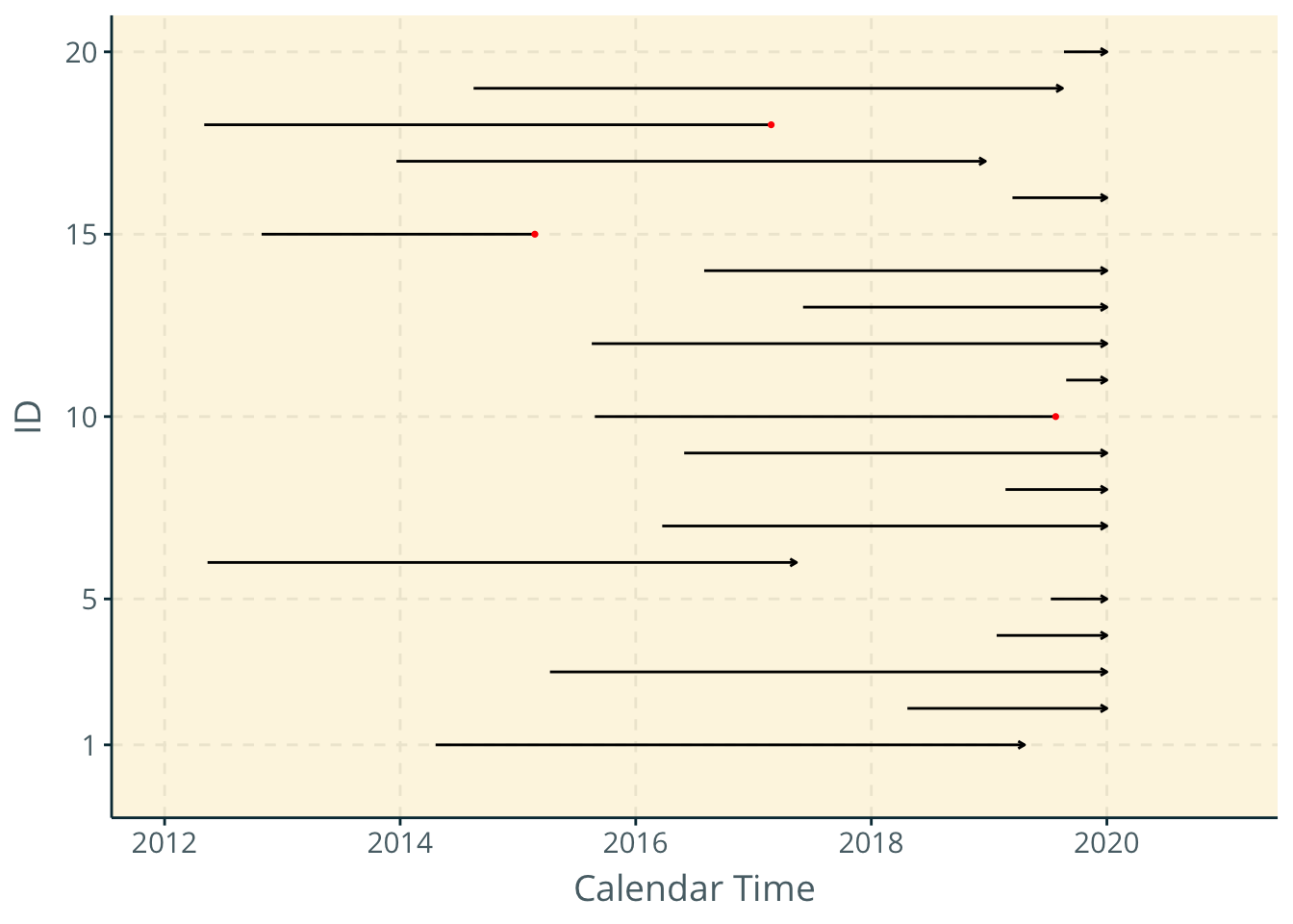
Reorganize plot to show time since entry into HIV care on the x-axis.
# Calendar time as timescale
line2 <- ggplot() +
  geom_segment(data = dat %>% filter(y==0), aes(x = 0, y = id, xend = t, yend = id),  arrow = arrow(length = unit(0.1, "cm"))) +
  geom_segment(data = dat %>% filter(y==1), aes(x = 0, y = id, xend = t, yend = id)) +
  scale_y_continuous(name = "ID", breaks = c(1, 5, 10, 15, 20), limits = c(0,20))+
  scale_x_continuous(name = "Calendar Time", breaks=c(0, 1, 2, 3, 4, 5), limits = c(0, 6)) +
  geom_point(data = dat %>% filter(y==1), aes(x = t, y = id), color = "red", size = 0.6) +
  theme(text = element_text(size = 14, family = "Open Sans"))

line2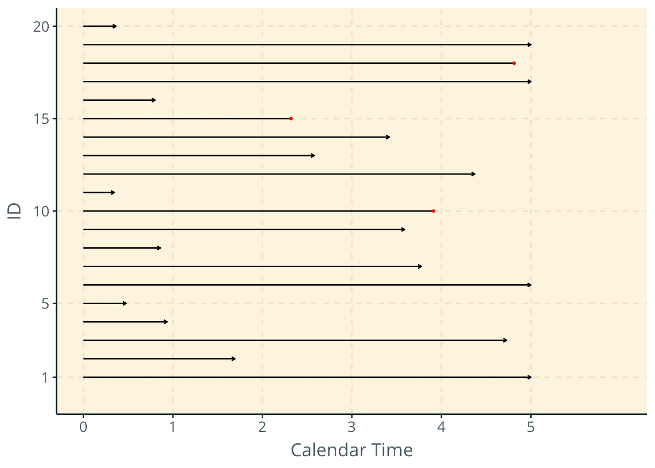
Example data (similar to Cole & Hudgens 2010)
Next, we read in some sample data similar to that used in Cole & Hudgens 2010.
##   int     year        w        t cenyear d late newid yearw    yeart
## 1   1 2010.320 4.679838 5.527338    2020 1    1     1  2015 2015.848
## 2   1 2010.321 4.678720 9.557808    2020 1    1     2  2015 2019.879
## 3   1 2010.427 4.573213 9.573213    2020 0    1     3  2015 2020.000
## 4   1 2010.509 4.490943 9.490943    2020 0    1     4  2015 2020.000
## 5   1 2010.645 4.355168 9.355168    2020 0    1     5  2015 2020.000
## 6   1 2010.775 4.224887 9.224887    2020 0    1     6  2015 2020.000
Calendar timescale
### Create second dataset with only events ------
exdat2 <- exdat[exdat$d == 1, ]

### Plot the lines -----
line <- ggplot(data = exdat) +
  geom_segment(aes(x = year, y = newid, xend = yearw, yend = newid), lty = "dotted") +
  geom_segment(aes(x = yearw, y = newid, xend = yeart, yend = newid)) +
  ylab("ID") +
  scale_x_continuous(name = "Calendar Time", breaks=c(2010, 2015,  2020)) +
  geom_point(data = exdat2, aes(x = yeart, y = newid), color = "red", size = 0.5) +
  theme(text = element_text(size = 16, family = "Open Sans"))

line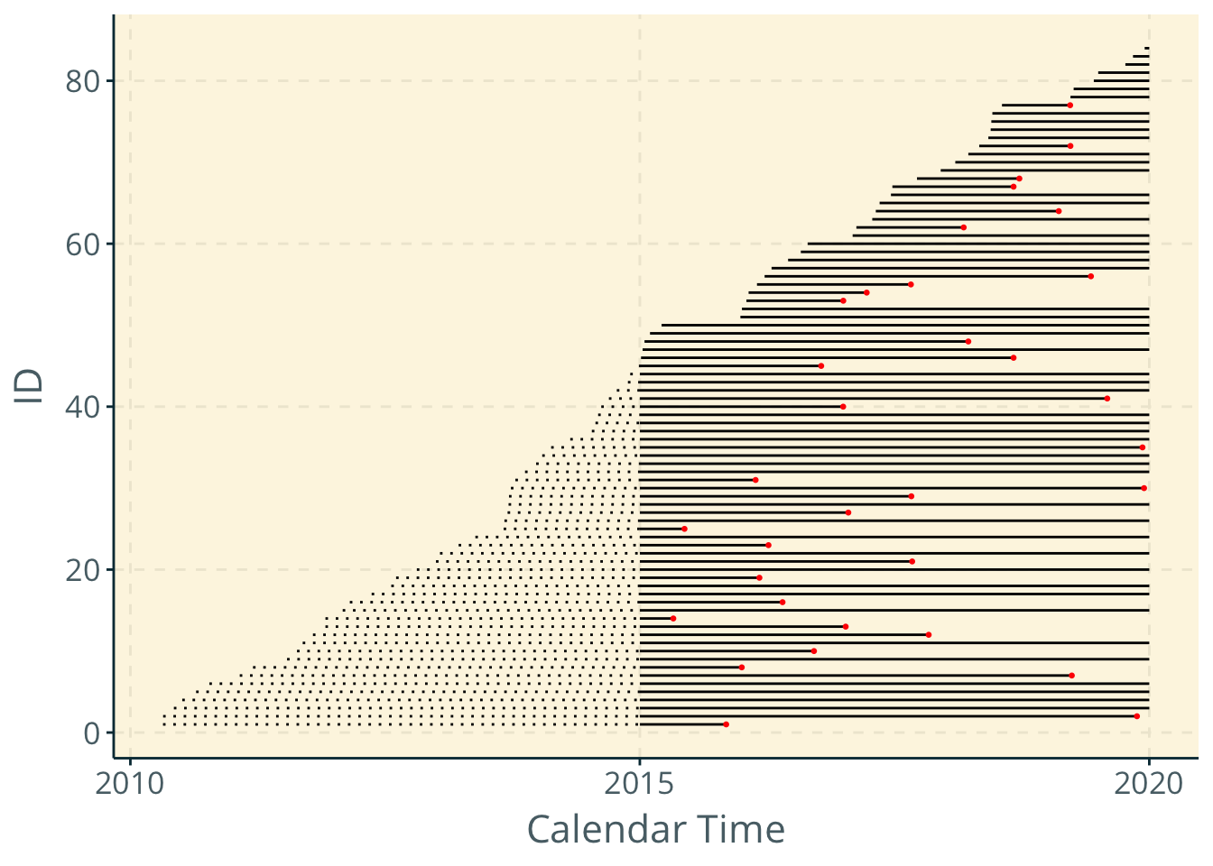
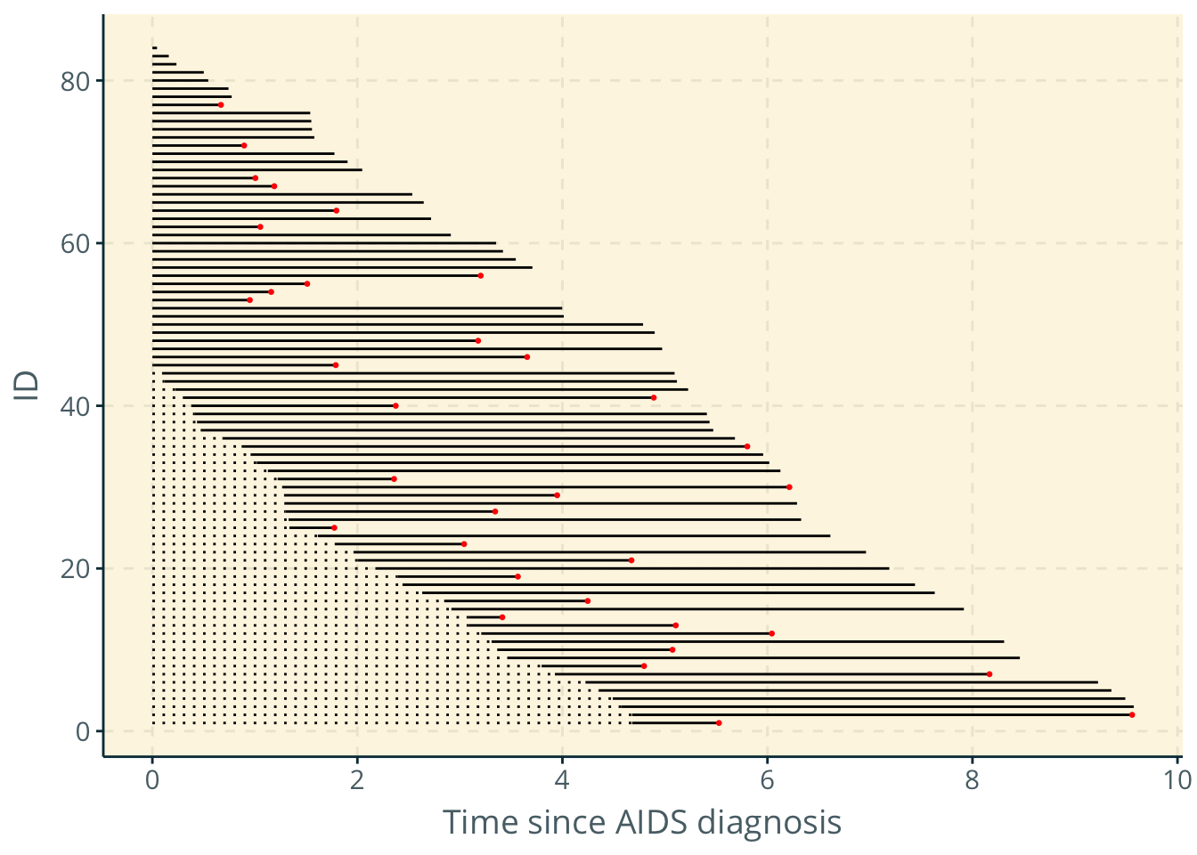
Time since AIDS diagnosis
line2 <- ggplot(data = exdat) +
  geom_segment(aes(x = 0, y = newid, xend = w, yend = newid), lty = "dotted") +
  geom_segment(aes(x = w, y = newid, xend = t, yend = newid)) +
  ylab("ID") +
  scale_x_continuous(name = "Time since AIDS diagnosis", breaks = c(0,2, 4, 6, 8, 10)) +
  geom_point(data = exdat2, aes(x = t, y = newid), color = "red", size = 0.5) +

  theme(text = element_text(size = 14, family = "Open Sans"))

line2